Design Challenge
#1: How might we keep our communities in Singapore safe and healthy during the global COVID-19 pandemic?
Project Description
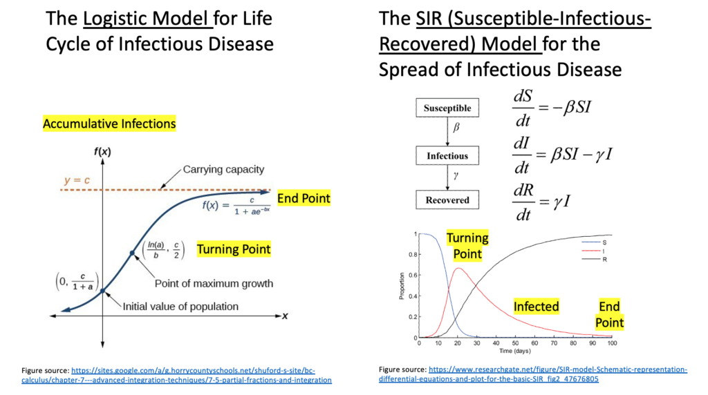
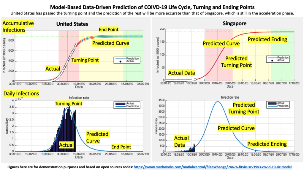
Pandemics have a life cycle pattern from outbreak to the acceleration phase, inflection point, deceleration phase and ending. Such a life cycle pattern is the result of the adaptive responses of individual behaviours and government measures, and have theoretically-established math models, e.g. logistic model and SIR. We use daily and growing COVID-19 infection data to regress and train a math model for COVID-19 in Singapore and a few key countries, and use the trained model to predict the dates of the turning and ending dates of the life cycle curve to inform planning of governments, companies and individuals. A web interface will be created to visualize the pandemic evolution, predicted curve and report estimated end dates, all of which are updated daily with latest data available.
Criteria #1: Value
It is important for the public and the government to not only monitor what happened, but also predict the development of the pandemic, in order to inform decisions and planning ahead. The proposed data-driven prediction and visualization can prepare the mentality of the public and also inform the decisions of governments regarding what are going to happen if we do nothing new down the road and also what we should do accordingly. Such predictive monitoring will allow decisions made now be more future-informed.
Criteria #2: Inspiration
The first inspiration is from existing online COVID-19 monitors, such as the one at John Hopkins Univ., which only report confirmed or death cases (what happened), but do not provide predictions on what might happen next. The other inspiration is the understanding that all pandemics follow a life cycle pattern, for which there exist well-established mathematical models, such as logistic model or SIR model. In this case, we plan to use the logistic model. The SIR model is also suitable and found to provide similar data-fitting and predictions with the logistic model. We might also incorporate it as plan B if the logistic model does not fit data well.
Criteria #3: Impact
The proposed data-driven prediction and visualization can prepare the mentality of the public as the pandemic continues to evolve and also inform and guide the planning of governments and companies ahead of the status quo. Such predictive monitoring will allow for the decisions and planning that have to be made now for the future to be more future-informed. Furthermore, the system, which is developed in the realistic contexts of several focal countries during current COVID-19 pandemic, can be applied to more countries and later pandemics.
Criteria #4: Timeliness
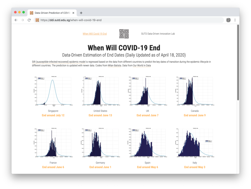
Month 1: Prototype and publicly launch the web interface. We have quickly put together a prototype based on the SIR model, instead of the logistic model for training and prediction. It is accessible at https://ddi.sutd.edu.sg/when-will-covid-19-end/. The parameters in the back end algorithms are tentative and need to be optimized. The visualizations also need to be improved. One month should be enough to optimize the system to the needed rigor for data-driven prediction and to the needed effectiveness for the data-driven visualization.
Month 2: Seek feedback and refine the algorithm and interface.
Month 3: Customize the system to work for more countries and to be ready for quick deployment in later pandemics.
Criteria #5: Systems Thinking
The proposed web-based interface for pandemic prediction and visualization moves beyond simply reporting historical data (what happened) to predicting the next developments, based on a theory/model-based data-driven approach.


